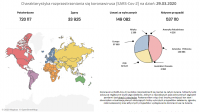
A WUT doctoral student creates a panel for visualizing the coronavirus pandemic
“Fear and ignorance are among the greatest non-health risk factors of this pandemic,” says Mateusz Soliński of the Warsaw University of Technology Faculty of Physics and the “BioS” Biophysical Measurement Student Research Group, the originator of the solution. “I wanted to improve that a little bit.”
The panel includes a number of maps and charts showing case, death and recovery counts. You can check the coronavirus data for a specific country and continent; the infection growth rate; cases per 1m population or comparative data of case totals country by country starting at day 0 of the outbreak in each country. A summary table for all countries is also available.
The panel was created in Tableau and is updated once a day. It works well on computers or tablets and the author is currently working on a mobile version. The source of information is the data aggregated by Johns Hopkins CSSE, an open data repository which pulls coronavirus data from multiple sources, including WHO, Worldometer or the Ministries of Health in the respective countries.


